
 Star on GitHub
Introducing package:shad, shadcn/ui for Flutter
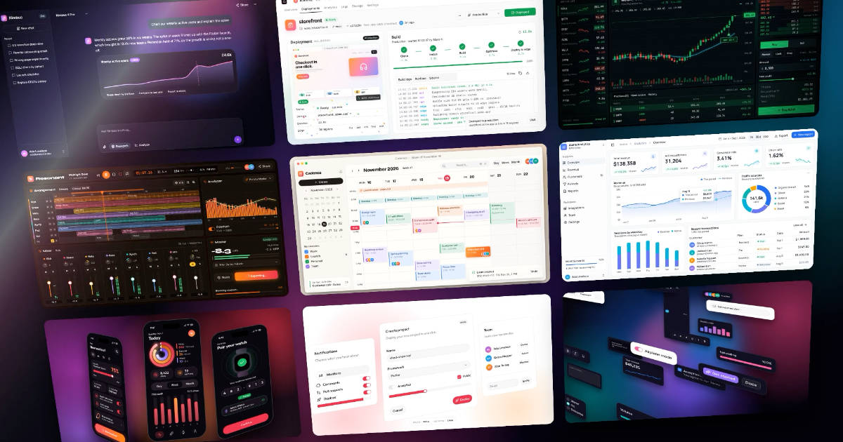
shadcn/ui has become the default look for web dashboards, admin panels, and developer tools. It is a set of plain, well-proportioned components that you copy into your project and theme with a handful of CSS variables. Today we are writing about package:shad, our pixel-perfect Flutter port of it. It has more than 40 components, all eight shadcn/ui styles, and a range of color schemes in light and dark. It does not depend on Material or Cupertino.
shad is production-ready and follows semantic versioning.
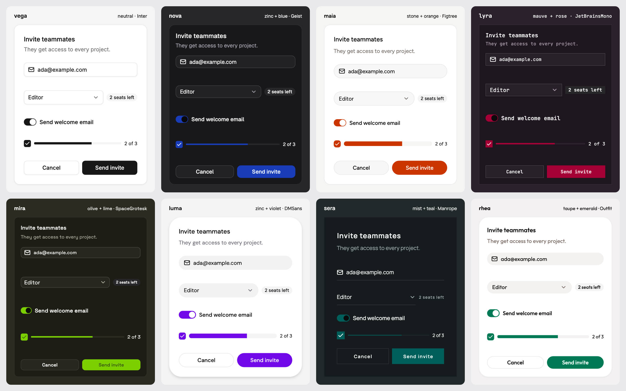
One card, eight styles. Each cell is the same widget tree with a different theme.
Why we built it
We build the Serverpod Cloud console in Flutter. A cloud console is a dense application. It has a sidebar, data tables, forms, dropdown menus, dialogs, toasts, and people use it in the browser for doing real work. We wanted it to look and behave like the best web consoles, and most of those are built on shadcn/ui.
We looked for a Flutter package that matched shadcn/ui closely enough to use as is. The best starting point was flutter-shadcn-ui by Alexandru Mariuti. It gave Flutter a shadcn-style component set, a clean API, and a theme system that already covered most of what a dashboard needs. shad is a fork of that work, and it would not exist without it. Thank you, Alexandru.
What we needed on top of it was fidelity. When a design is written in shadcn/ui terms, a Flutter build of it should come out the same. That means the same heights, paddings, radii, borders, shadows, and colors. Close was not enough for us, because small differences add up across a full application, and because shadcn/ui has since grown from one look into eight named styles. So we forked the package as shad and spent the months up to 1.0 matching every component and theme to the original implementation.
What "matched to the original" means
We did not match shad by eye. Every visual value is read from the shadcn/ui source and then checked by tests.
- Styles are measured, not approximated. The eight styles (
vega,nova,maia,lyra,mira,luma,sera, andrhea) differ in much more than corner radius. Each one sets its own control heights, padding, borders, shadows, focus rings, and text sizes.shadtakes every one of these values from the shadcn/ui source, for every style. - Colors are converted, not copied. shadcn/ui defines its palettes in OKLCH.
shadconverts them to sRGB with the real Oklab math, and a test pins every value. - CSS and Flutter differ in places, and
shadhandles each one. For example, a CSS height includes the border, but a FlutterContaineradds the border outside its child. CSS also clips a shadow to the outside of the element, which a FlutterBoxShadowcannot do. Details like these are small, but together they decide whether a screen looks right. - Tests lock the geometry. Control heights, calendar cells, menus, and focus rings are checked against the reference values for every style. A visual change that moves a component closer to shadcn/ui counts as a bug fix in our versioning policy, not as a breaking change.
The result is that you can take a design built with shadcn/ui on the web and build the same screen in Flutter.
One theme, many looks
A shad theme has three independent parts. These are a style, a color scheme, and a font. The color scheme follows shadcn/ui's own split into a neutral base color and an optional accent.
ShadApp(
  theme: ShadThemeData(
    colorScheme: const ShadStoneColorScheme.light()
        .applyAccentScheme(ShadAccentScheme.orangeLight),
    style: ShadStyleTokens.maia,
    textTheme: ShadTextTheme(family: 'Figtree'),
  ),
  home: const SettingsPage(),
)
Change maia to lyra and every control in the app becomes square-cornered and more compact. Change the accent and the primary buttons, switches, charts, and selection colors follow. Light and dark mode are a pair of color schemes, and ShadApp switches between them.
The images below are five demo screens built only with shad widgets. Each one uses a different combination.
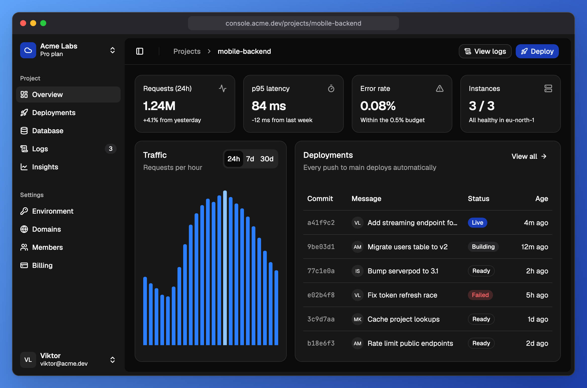
A cloud console in the nova style, neutral with a blue accent, set in Geist.
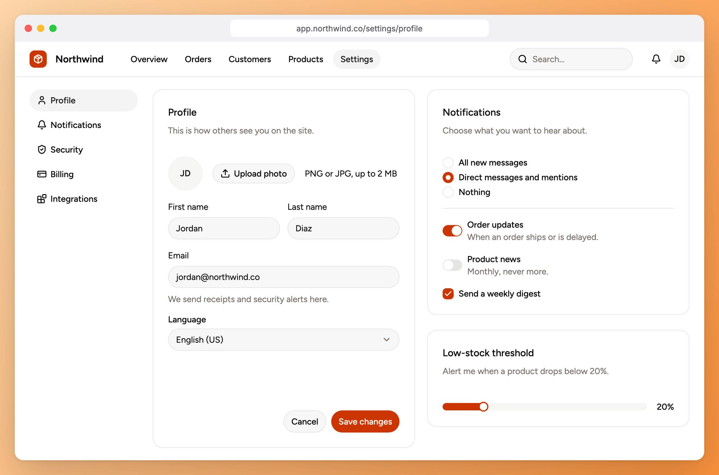
A settings page in the maia style, stone with an orange accent, set in Figtree.
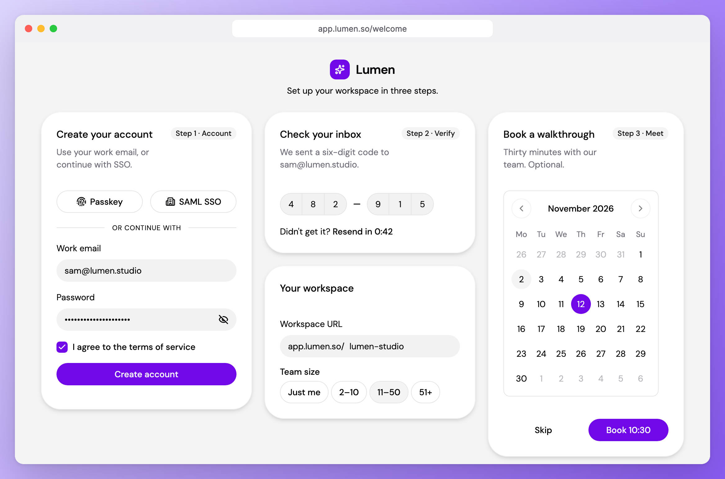
A sign-up flow in the luma style, zinc with a violet accent, set in DM Sans.
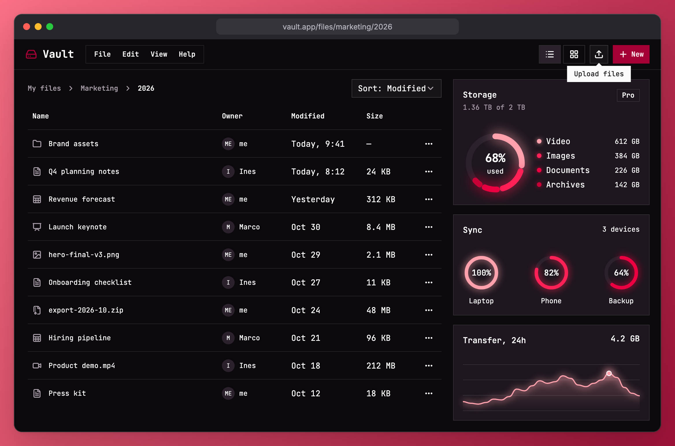
A file browser with storage charts in the lyra style, mauve with a rose accent, set in JetBrains Mono.
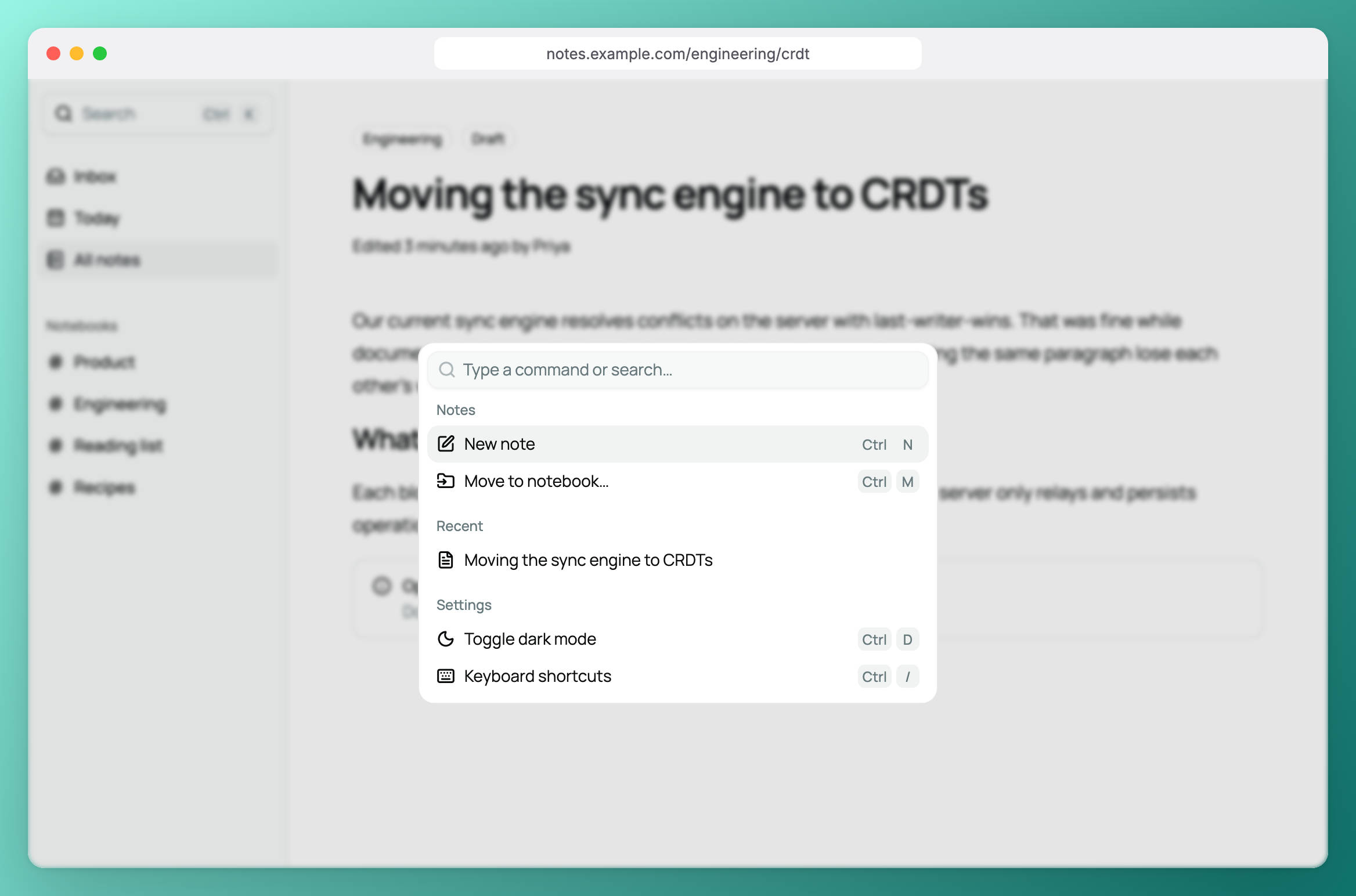
A notes app with the command palette open, in the vega style, mist with a teal accent, set in Manrope.
Where we use it
shad runs in production in the Serverpod Cloud console, and all of our internal Serverpod tooling uses it.
It is also the UI layer of Wonky Work, an office suite built in the open with Flutter and Serverpod. Wonky Work has four apps. Drive is for files, Write for documents, Sheets for spreadsheets, and Slides for presentations. They run in the browser and support real-time collaboration, comments, and version history. An office suite is a strong test for a component library. It has menubars with nested submenus, toolbars full of icon buttons and toggles, side panels, comment threads, and dialogs on top of a canvas. All four apps share one shad theme.
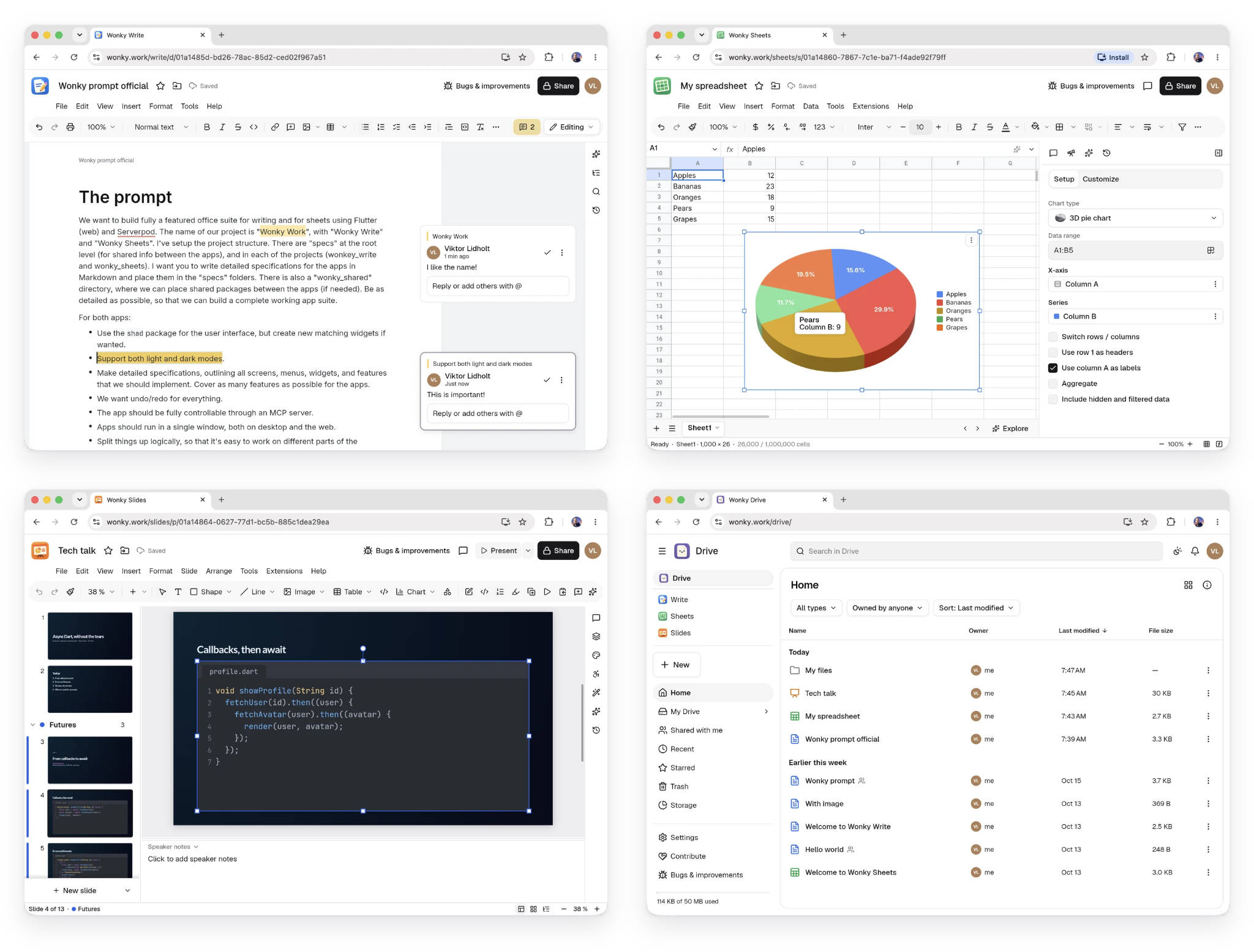
Wonky Write, Sheets, Slides, and Drive. The menus, toolbars, side panels, and dialogs are shad components.
Built for where Flutter is going
Flutter is moving the Material and Cupertino libraries out of the SDK and into the material_ui and cupertino_ui packages. package:shad/shad.dart imports only Flutter's widgets layer, so it is not affected by that move. ShadApp has its own page route, scroll behavior, and theme mode. If you want to use Material or Cupertino widgets next to shad widgets, import package:shad/material.dart and wrap your app in a ShadMaterial. It derives a Material theme from your shad theme, so both sets of widgets match.
Get started
Add the package to your app.
flutter pub add shad
Then explore the documentation and component browser. Every page shows a live example next to the exact source that renders it, and the built-in theme editor lets you try styles, color schemes, and fonts. The source is on GitHub. We welcome issues and pull requests.